
Saturday, February 26, 2011
Photoshop tone tests
I was playing around with monochrome tones in my last project and so decided to play some more. Here is a gray tone test in photoshop. I tried converting it with the zipatone filter but it wasn't all that great. I really like the look of zipatone but I can't make it work in photoshop. If anyone can instruct me on what to do or direct me somewhere that can help that would be great.

Info pamphlet 2
Here is the final delivered work for the info pamphlet. My clients work on Macs and I use a PC so there were some fonts they wanted I was unable to get to work on my machine, therefore some of the text was tweaked with these new fonts on their end of things making these files not the final final renditions of things...but close enough.
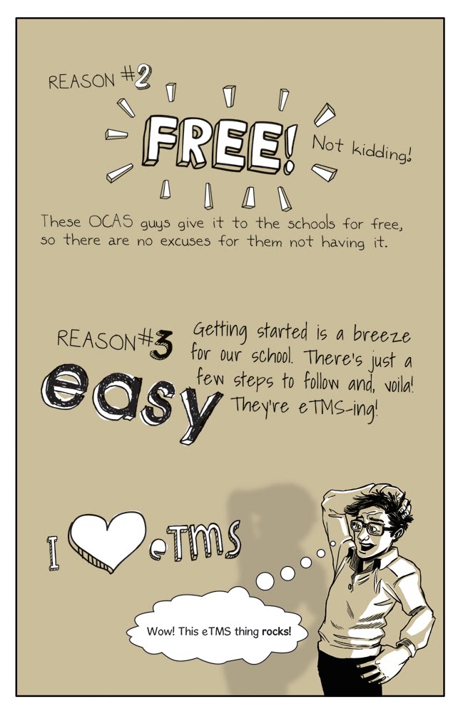
The client wanted an "Indie/Graphic novel look to the work", examples given were work by Joe Sacco and the graphic novel "City of Glass" and a few others I can't recall. "Not too cartoony" was mentioned and Marjane Satrapi's Persepolis was used as an example for that...which was too bad I'm a big fan. We also focused on the work of Scott McCloud and used his work for "Google Chrome" as inspiration and direction.
I only had 12 days to complete this project and have it ready for print. It included, layout, pencils, inks, tones and text in both French and English. It was a very tight schedule. There were hard deadlines every day and feedback corrections to execute every day several times a day. Got there in the end though :)


Info pamphlet 1
Some of the preliminary build up work for my last project, an info pamphlet. I only had 12 days to complete this project and have it ready for print. It included, layout, pencils, inks, tones and text in both French and English.


Subscribe to:
Posts (Atom)